
Most web content falls into one of two categories: There’s the visual content, like images and graphics, and then there’s the text, the actual words that spell out your message. The font is the place where these two elements meet. In order for your site to look cohesive and professional, you need to choose a font (or a font palette) that fits the overall aesthetic of your site. Here are some things to consider when choosing a font.
Think about Tone
Different fonts can affect how a viewer interprets the text on a subconscious level. What tone are you trying to convey? Authoritative and trustworthy? Whimsical? Elegant? Snarky? Viewers pick up on these nuances through visual cues just as much as they do through the actual words on the screen. It’s jarring to read a word like SOFT written in a harsh, bold font like Impact. Choose a font that enhances your message.
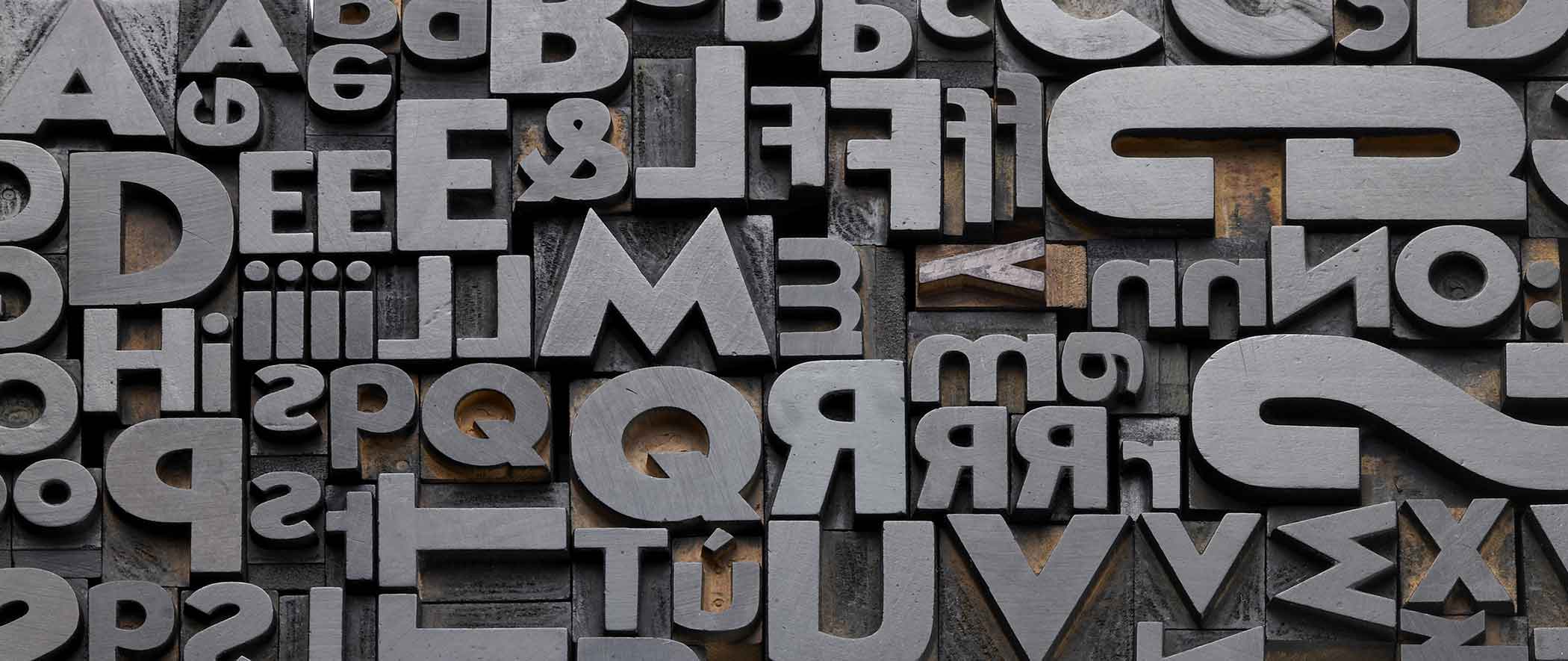
Serif vs. Sans Serif
At the most basic level, fonts fall into one of two typeface families, serif or sans-serif. Serif fonts have those small lines (called serifs) extending from the ends of each line in the letter, like Times New Roman. Sans-serif fonts do not have these lines. While both styles can be appropriate for web content, an interesting study from MIT researchers suggests that serif typefaces read as more classic, traditional, and formal, while sans-serif feels more casual and modern.
Focus on Legibility
“Form follows function” was the mantra of 20th century modernist architecture and interior design. This principle applies to building websites just as well as building skyscrapers. The concept is simple. Any design element you add should further the goal of the whole project. The purpose of text on a webpage is to convey your message. You should choose a font that helps your viewer get the message clearly and without distraction. If it’s difficult for the viewer to distinguish words and letters, they may not stick around long enough to get your message.
If you take a quick look at some of the websites you frequent, you will probably notice a trend. High-traffic websites stick with fonts that are simple, clean and easy to read. This doesn’t mean you can only choose from fonts like Arial, Calibri, or Times New Roman, but it does mean that you should think hard before getting sucked in by the sexy serifs of Magneto.
Pay Attention to Color Contrast
Color is a great way to inject some fun and creativity into your font choice and add to the overall aesthetic. The most important thing to keep in mind is the contrast between the font color and the background. A common mistake people make with web design is choosing a color scheme where the text and the background don’t contrast enough, or contrast so sharply that it hurts your eyes to look at it for too long.
In general, darker text on a lighter background is the easiest to read. Of course, the reverse is always an option, just keep in mind that the contrast should be sharp enough for the viewer to see that the words as distinct from the background, even from a few feet away.
Try Mixing Fonts
Using contrasting fonts is another strategy for creating variety and interest. The juxtaposition of two very different styles can give the whole page a satisfying sense of visual balance. You can also change up a single font by using bold, italics, or all caps versions of the same font or by adjusting the kerning (space between the letters). Just be careful not to go overboard!
If you are going to mix fonts, you should do it consistently. For example, use one font for all section headers and a second font for all long-form body text. We typically recommend no more than 3 different fonts on a single page. This limits visual clutter and prevents slow loading speeds.
Hopefully we’ve given you some helpful tips to consider when choosing the right font or fonts for your site. And if you need a little more direction, Den Web Design would be happy to help you build a custom font-palette that fits your branding and your style.


Join the discussion One Comment