The American way says bigger is always better, but when it comes to web design, the more minimal approach of flat design is on the rise. So what is flat design, and why should you care? Here’s what you need to know.
What is Flat Design?
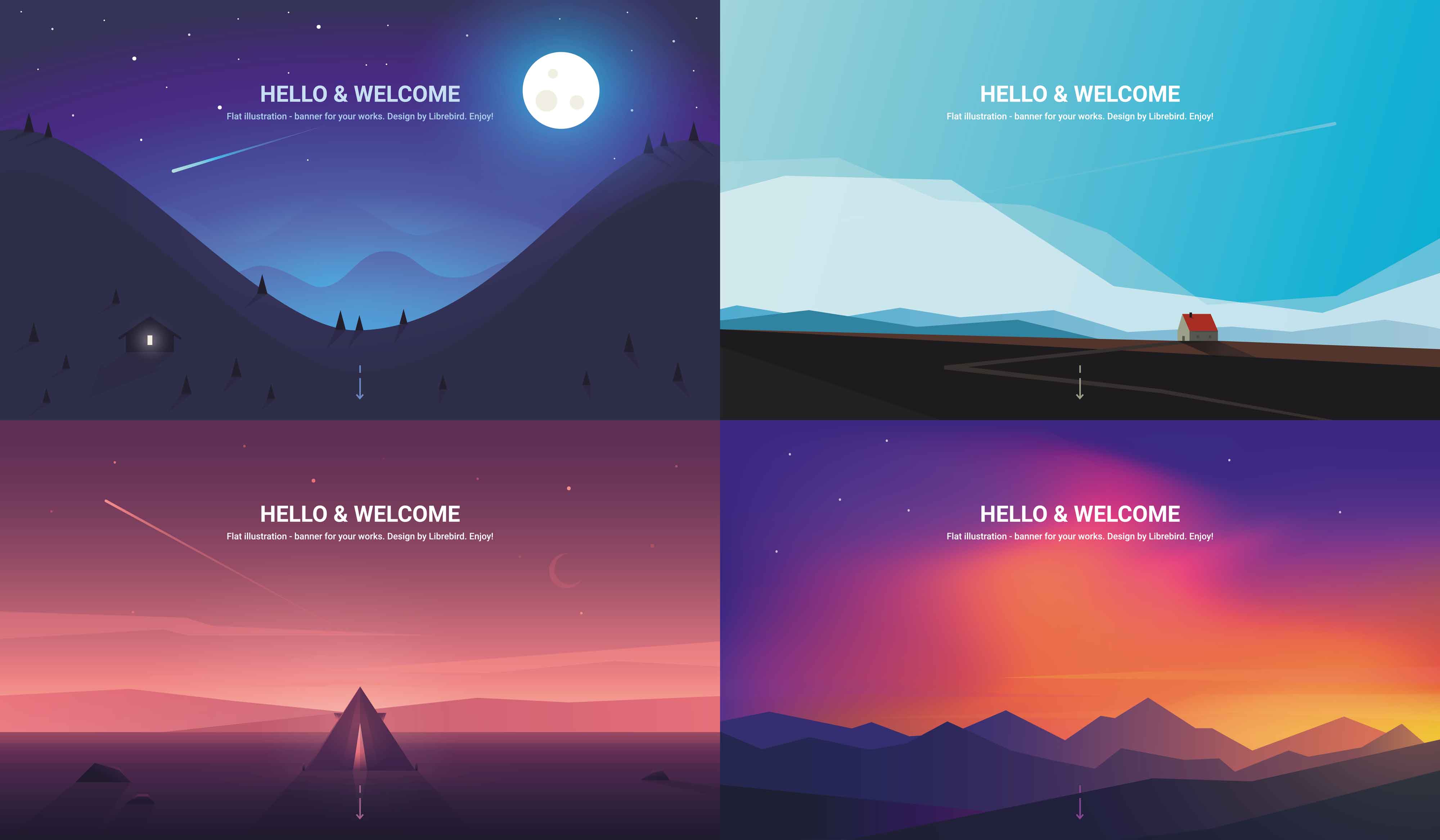
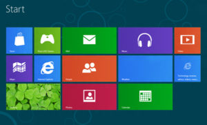
As the name suggests, flat design websites consist of images and text represented in a “flat” 2D format. Instead of using shadows or textures to make images appear more realistic, flat design embraces clean- cut shapes with very little detail. A classic example is the layout of apps on the Apple iPhone and iPad. This style first hit the scene back in 2012 and 2013, and it’s still going strong.
Flat Design Vs. Minimalism
Many people confuse flat design with minimalism, but the two are not the same. Flat design refers to the aesthetic style of a website. Minimalism is about distilling the layout and navigation of a website to its simplest and most straightforward forms. Flat design is mostly about looks. Minimalism is mostly about function. In other words, while flat design and minimalism share some features, not all flat design sites are minimalist, and not all minimalist sites use flat design.
Advantages of Flat Design
Since flat design is primarily a visual feature, an obvious advantage is achieving a look you like that suits your brand. Clean lines and simple shapes can look chic and effortless, while injecting bright colors gives off a fun, whimsical vibe.
There are also some advantages on the functional side of things. A simple, 2D look is easy to manage and typically improves issues with slow loading speeds and browser compatibility. It’s also simpler to create responsive websites that can adapt to different kinds of devices. Having a mobile-friendly site is extremely important now that so many people access websites from their handheld computers…I mean, phones.
Limitations of Flat Design
Like any design feature, one size does not fit all. The simplicity of flat design is part of its appeal, but it can also be a weakness. A site with flat buttons with simple icons might seem easier to use, but it can also be confusing if it isn’t clear what each icon stands for. It can also be hard to tell which images are clickable buttons and which aren’t, which can frustrate the user.
Another potential con is that when the style is so simple, it can be hard to make your site stand out from other flat design sites. It can also be difficult to communicate more complex goals and messages within the limitations of the design.
The Emergence of Material Design
Thanks to the development of Flat 2.0, a computer language created by Google, a hybrid style called material design emerged. Material design is similar to flat design, except that it does use some dimensional elements. Comparatively, material design is more versatile. However, by adding in a z-axis and by using layers and animations, material design is harder to manage and can have slower load times and more compatibility issues.
***
Even with its limitations, there are reasons why flat design continues to be popular. It’s sleek, it’s sexy, and it’s not trying too hard. Of course, flat design won’t be optimal for every website. Luckily for you, we are pros at exploring different options and giving our honest opinion. We’d love to talk with you about the kinds of designs you love and what will work best for your needs. Be sure to contact us if you’d like to know more.